Visit Tampere Oy
The new Visit Tampere site guides, helps and inspires visitors to the region
“The website renewal went very smoothly from start to finish. Into’s project team quickly grasped our goals and our vision, which made the collaboration easy and efficient throughout. At no point did we feel that a solution to the challenges ahead could not be found together.”
- Client
- Visit Tampere Oy
- Web service
- visittampere.fi (opens in a new tab)
- What we delivered
- Design
- Care
- Software development
- Service design
- Strategy
- Integrations
- Accessibility
- Team
- Ella KillinenDesign
- Jani HiekkaSoftware development
- Tuomo RäisänenSoftware development
- Mikko ErolaProject management



About the client
The new visittampere.fi guides and inspires visitors and strengthens Tampere’s appeal as a tourism and event city. Visit Tampere is the City of Tampere’s tourism marketing organisation. It works to make Tampere a more attractive destination at home and abroad. We designed and built the site, and the collaboration continues with Care (Huolenpito) and further development.
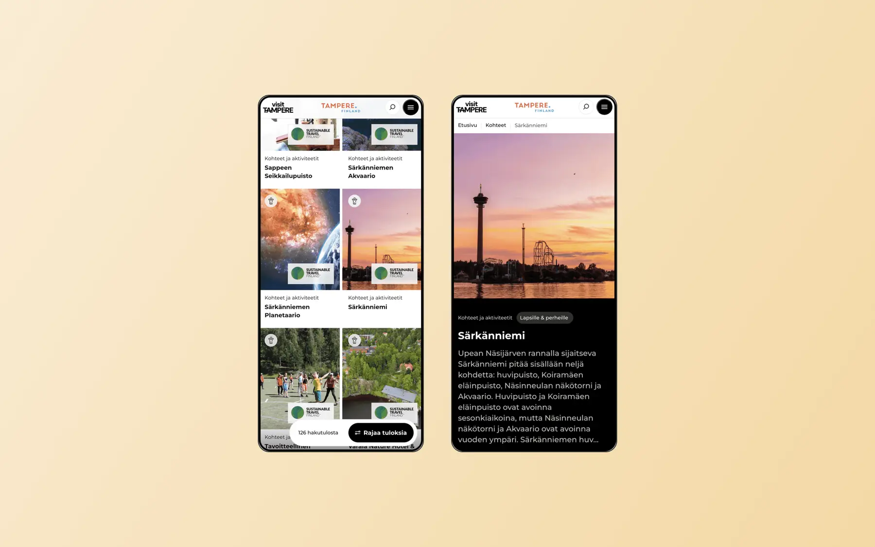
The new Visit Tampere site aims above all to guide and inspire visitors, and to grow Tampere’s appeal as a tourism and event city.
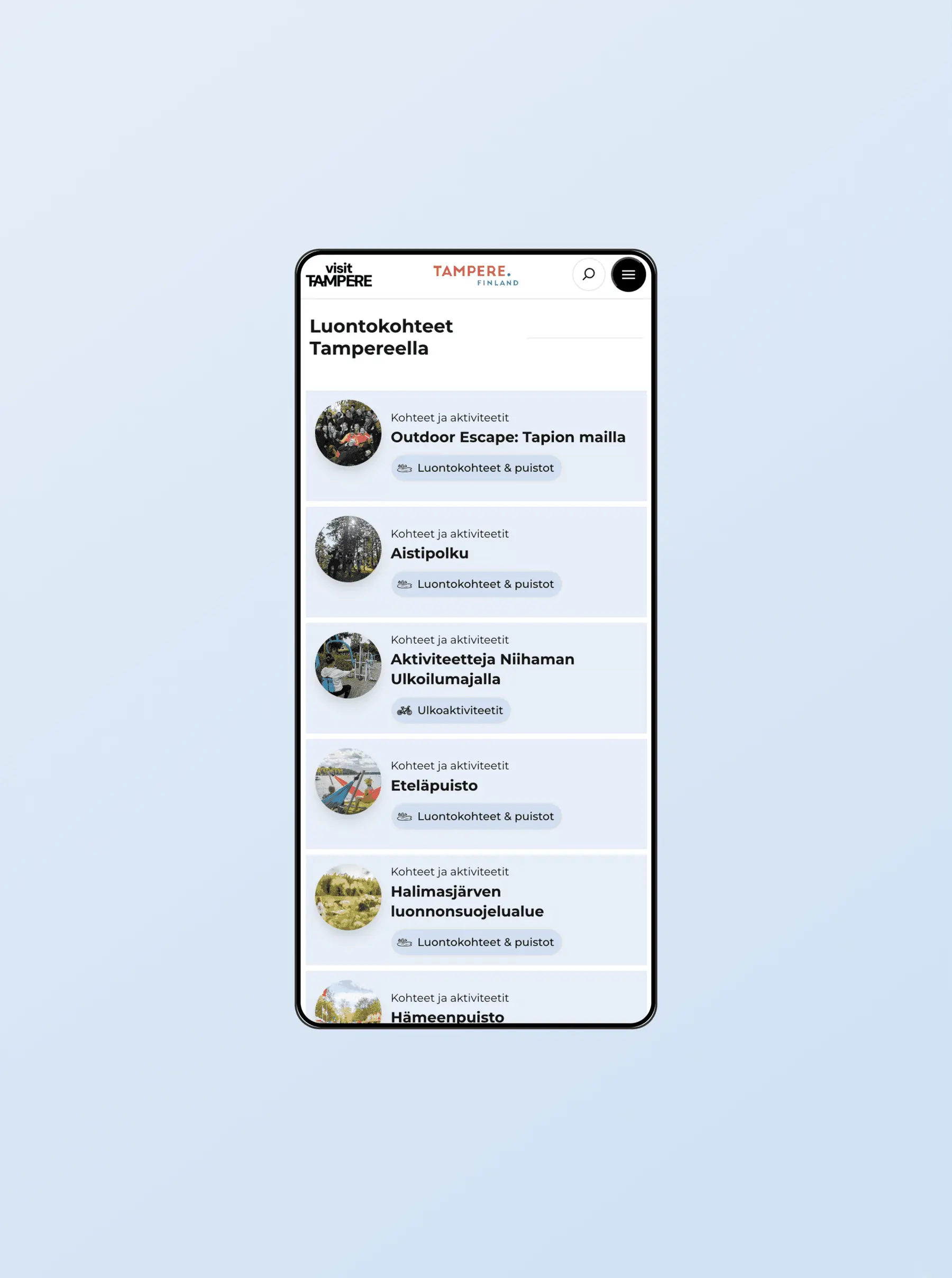
About 80% of the site’s visitors use a mobile device, so mobile first was not just a principle. It was a concrete decision that steered the design.
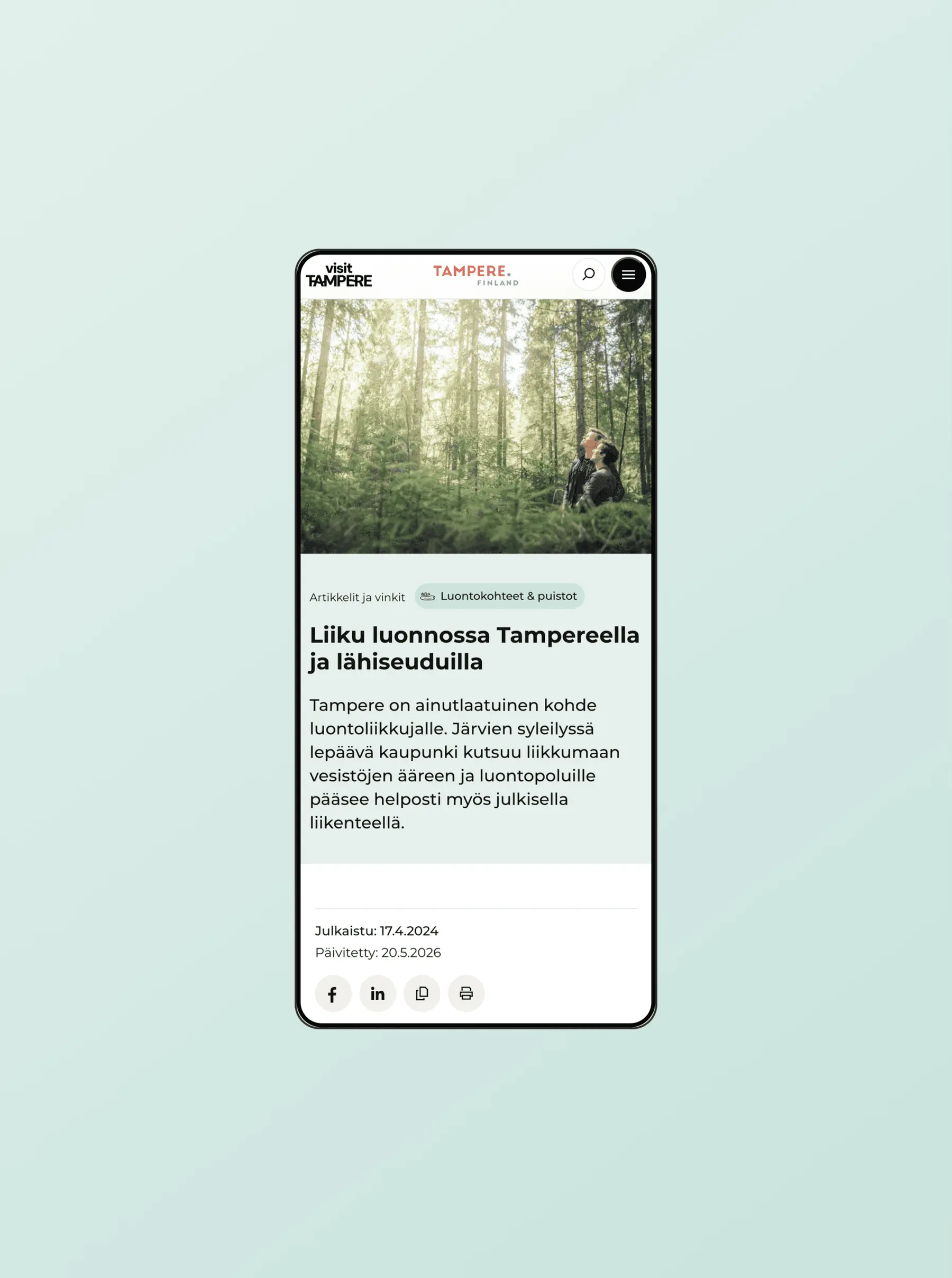
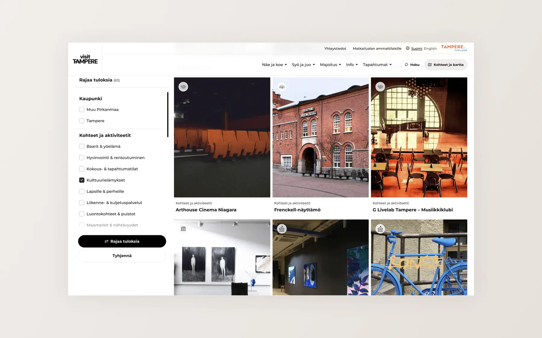
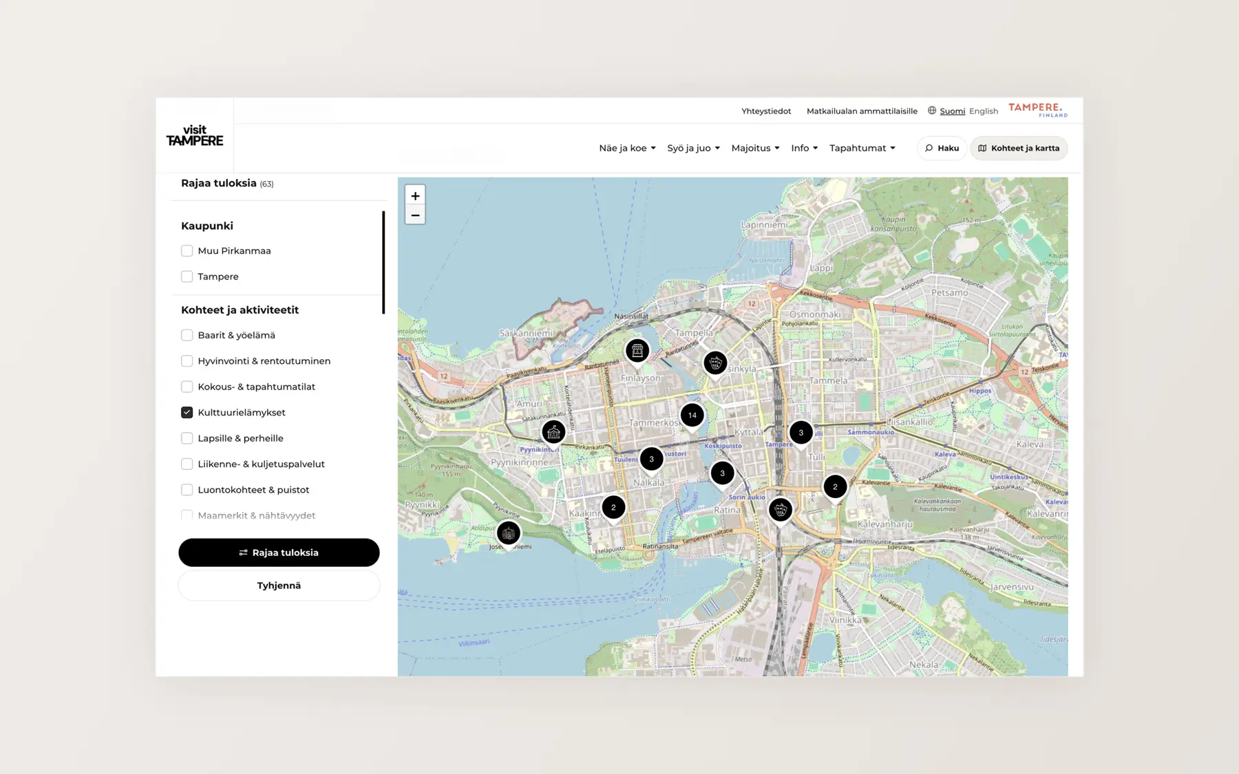
The thread running through the whole site is the set of places to visit, fetched through an integration with a national data source. Visitors explore them through filters and listings, maps, dynamic blocks and tip articles.
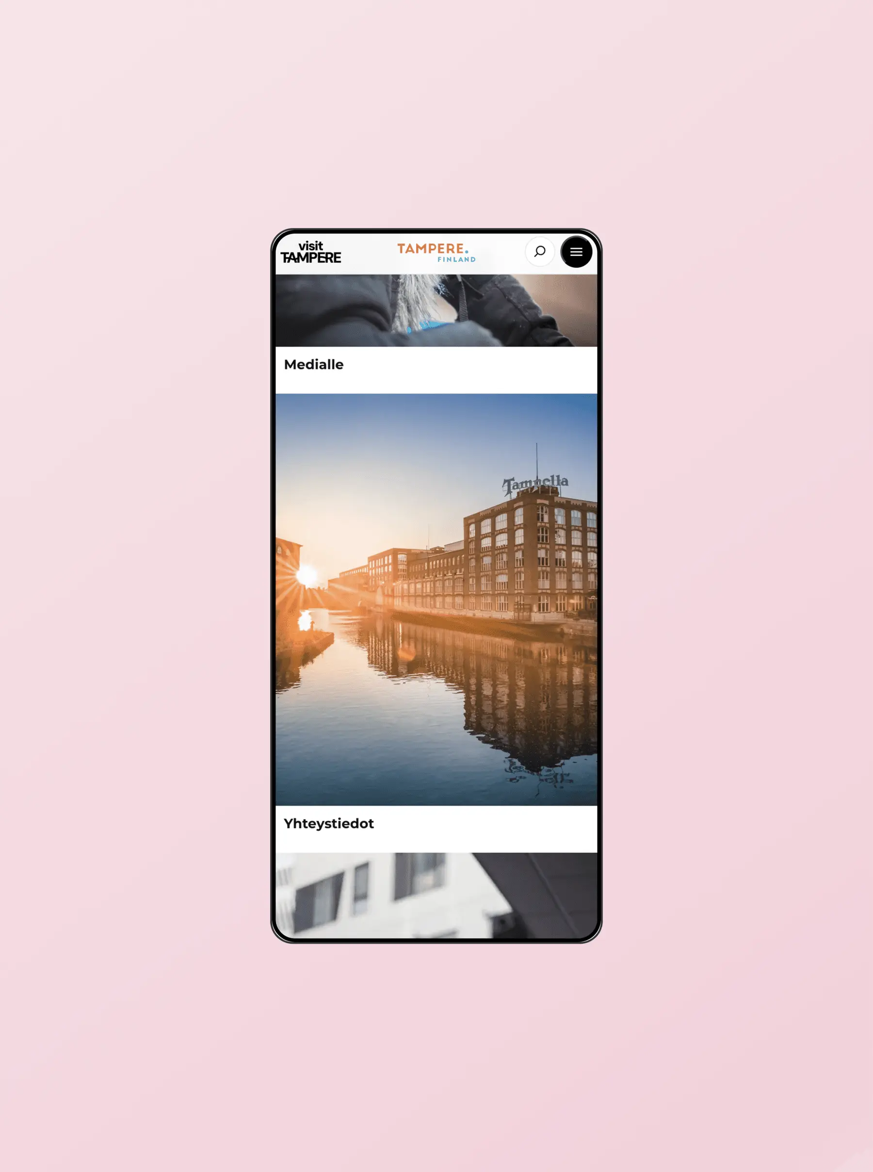
The old site had several problems. Content management was inefficient and technical reliability was poor. Search and filtering worked badly, and the structure was unclear. The visual look was dated too.
Visit Tampere knew what it wanted: a site that inspires and guides, and works first of all on mobile.
In the specification phase we clarified the content and functions that serve visitors best.
The thread running through the new site is the places to visit in the Pirkanmaa region. We fetch them through a national tourism data hub integration. Visitors explore them through filters and listings, maps, dynamic blocks and tip articles. The articles and tips present the region’s attractions and tell visitors what is worth doing and experiencing in Tampere.
Places to visit are grouped into types on the site (for example Restaurants & cafés, Sports & activities, Museums & galleries). These types work as filters in every archive on the site: articles, places and search results. The seasons are also available as a filter in every archive.
About 80% of the site’s visitors use a mobile device, so mobile first was not just a principle. It was a concrete decision that steered the design.
The look of the interface brings out the atmosphere of Tampere, for example through high-quality image and video slots. The site is fresh, user-led and inviting.
We built a predictive search. The client can bring popular or otherwise noteworthy content into view before a search is made.
The navigation has two levels. The content areas defined for visitors (for example See and do, Eat and drink, Stay) guide users from the first click.
The structure of the site supports natural user paths through landing pages and the dynamic feature blocks used on them.
Business and place data for Pirkanmaa’s tourism sector comes to the site from a national tourism data hub. The integration shows up-to-date place and business information without manual upkeep. Places from the national data source are listed in the places archive, where they can be filtered in a list or map view. Each place also has its own page, which the data fills in automatically.
Map blocks can also be embedded in individual articles. Building themed maps, such as “Tampere’s best public saunas”, is easy.
The client’s content producers build pages from ready-made block sets and templates. Typical content pages come together quickly without technical skills.
The collaboration continues with Care and development. We follow the data to see how the site serves visitors. We keep developing it.
More work
All workLumo Kodit
Lumo Kodit Oyj launched its new corporate website in March 2026, three months after the project began. We designed and built the whole site. Design agency Werklig created the brand identity. At the turn of 2025 and 2026 the listed company began preparing a brand renewal and a change of name. A change that size needs reliable partners.
Antell
Antell’s lunch menus, opening times and restaurant details now update themselves on its new website. Company customers also have their own pages for meeting rooms and catering. Antell wanted a site that matched its renewed brand and served both lunch guests and corporate customers. We took the brand’s “more is more” philosophy to every page.